When I worked as a psychometrician for large testing companies, I would always conduct an item analysis on the test questions to ensure that they were good and reliable. And when I often met with teacher groups to explain and discuss their statewide accountability test results, the teachers would always ask for the item analysis results. They wanted to know how their students did on each question. They wanted to know how hard or easy each question was and how many students selected each of the response options. Invariably, I would tell them that I could not provide them that information and would caution them from trying to generalize from the results of any one question.
Now, as I work with teachers to help them build better formative and other classroom assessment practices, I am happy to provide them with the item analysis results. To be good assessors of student knowledge, teachers need to know the quality of their test questions. To do this, I provide them with three simple statistics: (1) the P-value, (2) the point-biserial correlation, and (3) the response frequencies. These statistics are provided to teachers when they deliver their tests through the Naiku Platform.
The P-value is a measure of the question’s difficulty. It is the proportion of students who answered the question correctly. The point-biserial correlation is a measure of the question’s ability to discriminate between high and low performing students. Discrimination in this sense is a good thing. The question should discriminate in a way that higher performing students are more likely to answer the question correctly and lower performing students are more likely to answer it incorrectly. It is also a quick and effective indicator of whether the question was scored correctly or whether the question was misleading or tricky for some students. The response frequencies provide an indication of how many students selected each response option.
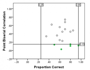
An effective way to utilize these statistics is through the following two graphs. Below, I’ve plotted the proportion correct (P-value) against the point-biserial correlation for each item. This scatterplot allows us to quickly see the “bad” items (the green dots in the figure). Here, these items have a low point-biserial correlation (I’ve set the minimum threshold to be 0.15). They may have been miskeyed (scored incorrectly) or may have been tricky or confusing to some students.

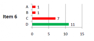
The figure below presents the results of the response frequencies for one item. As we can clearly see for Item 6, eleven students answered it correctly (the green bar), while seven students chose the incorrect option C. Let’s assume that option C was a common miscalculation made by students. With information like this, knowing that 7 of the 20 students made this common calculation error on the test, a teacher can feed this information back to the students to rectify that common mistake.

Item statistics can be of great help to teachers. As shown by the three simple statistics above, teachers can easily use these information in their formative assessment practice to make them better assessors of student knowledge, and ultimately, more effective teachers.

